
Tech Tip: Creating "Highlight Buttons"
PRODUCT: 4D | VERSION: 14.0 | PLATFORM: Mac & Win
Published On: May 8, 2014
Highlight buttons have become depreciated and are considered obsolete. However, many are still using highlight buttons and would like to continue using them. Highlight buttons can still be created and used through 3D buttons. Using the custom button style property there are two simple methods to create highlight buttons.
The first method creates a generic highlight button from the 3D button that allows designers to use it like the familiar highlight buttons. This method is done by creating a custom style 3D button and assigning a specific type of picture file to it.
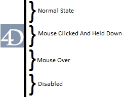
The picture file will be a 4:1 height to width ratio where each 1:1 portion from top to bottom represents four different states of the button: (Normal, Clicked and mouse held down on, mouse over, and disabled in that order). By leaving three of the sections representing states blank and having the section of the image the represents the click on and held state be a transparent image this will create a generic highlight button that can be used similarly to the old highlight button.
An Example Picture file:
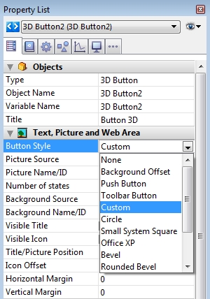
To apply the picture file the 3D button's button style property must be set to custom:
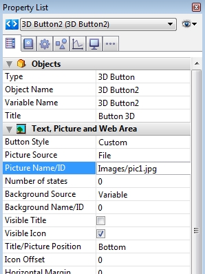
Then to select the image there are two methods, the simpler method is to simply click and drag the file to the button in the form editor. The other method is to place the file in your resource folder of the structure and using that as a root manually type in the location in the properties shown below.
Also it will probably be preferred to leave the title blank or turn off the title visibility and make sure the the number of states is 4 (0 and any number greater than 3 defaults to a 4 state button).
This will create the generic highlight button that can be used in a similar fashion to the old highlight button.
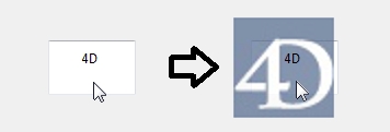
The image above shows the highlight button placed over a variable field and a text field. When not clicked or disabled it is displayed normally, however when clicked on and while the mouse is held down the "highlight" appears.
NOTE: that the highlight button's maximum highlighted area is only as big as the image's size and that scaling the button does not scale the image, it only shows the proper size of the image centered, leaving extra space if the button is larger than the image or a portion of the image if the button smaller than the image.
The second method is more time consuming, but creates less objects on the form. This method has the designer place the image that is going to be highlighted into the other states of the picture file. And have the clicked state be the image with a transparent color overlay. This allows for the button to act as both the picture and the button reducing the number of objects.
Example of picture file:
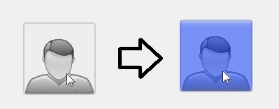
The product is a single object (a 3D button) that can take place of both a button object and a picture object with the same function as a highlight button. Below displays on the left the three other states applied and on the right displays the highlight activating when the mouse is clicked and held down.
Using these methods highlight buttons can be simply created in the place of the obsolete highlight buttons which are no longer supported and have an issue with staying in a "highlighted" state when disabled. A general highlight button can be created to use in multiple cases as before, as long as the picture dimensions cover the intended area or a single button can be created to take the place of both a picture and the highlight button, however the picture file will be specific.
The first method creates a generic highlight button from the 3D button that allows designers to use it like the familiar highlight buttons. This method is done by creating a custom style 3D button and assigning a specific type of picture file to it.
The picture file will be a 4:1 height to width ratio where each 1:1 portion from top to bottom represents four different states of the button: (Normal, Clicked and mouse held down on, mouse over, and disabled in that order). By leaving three of the sections representing states blank and having the section of the image the represents the click on and held state be a transparent image this will create a generic highlight button that can be used similarly to the old highlight button.
An Example Picture file:
 |
To apply the picture file the 3D button's button style property must be set to custom:
Then to select the image there are two methods, the simpler method is to simply click and drag the file to the button in the form editor. The other method is to place the file in your resource folder of the structure and using that as a root manually type in the location in the properties shown below.
Also it will probably be preferred to leave the title blank or turn off the title visibility and make sure the the number of states is 4 (0 and any number greater than 3 defaults to a 4 state button).
This will create the generic highlight button that can be used in a similar fashion to the old highlight button.
The image above shows the highlight button placed over a variable field and a text field. When not clicked or disabled it is displayed normally, however when clicked on and while the mouse is held down the "highlight" appears.
NOTE: that the highlight button's maximum highlighted area is only as big as the image's size and that scaling the button does not scale the image, it only shows the proper size of the image centered, leaving extra space if the button is larger than the image or a portion of the image if the button smaller than the image.
The second method is more time consuming, but creates less objects on the form. This method has the designer place the image that is going to be highlighted into the other states of the picture file. And have the clicked state be the image with a transparent color overlay. This allows for the button to act as both the picture and the button reducing the number of objects.
Example of picture file:
 |
The product is a single object (a 3D button) that can take place of both a button object and a picture object with the same function as a highlight button. Below displays on the left the three other states applied and on the right displays the highlight activating when the mouse is clicked and held down.
Using these methods highlight buttons can be simply created in the place of the obsolete highlight buttons which are no longer supported and have an issue with staying in a "highlighted" state when disabled. A general highlight button can be created to use in multiple cases as before, as long as the picture dimensions cover the intended area or a single button can be created to take the place of both a picture and the highlight button, however the picture file will be specific.