Tech Tip: List Box Vertical Scroll Bar Width Tip
PRODUCT: 4D | VERSION: 13.5 | PLATFORM: Mac & Win
Published On: August 1, 2014
When creating a listbox it is possible to create multiple columns of varying widths. For a nice design, some prefer that the total width of the column fit within the list box object so there will be no need for horizontal scrolling. Since list boxes typically display large arrays a vertical scrollbar is needed. The vertical scrollbar appears fixed on the left most side of the listbox and of itself is a certain width.
For Windows this width is 17 pixels and for Macs this width is 15 pixel.
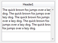
If the total width of the columns match the width of the object the last colomn's last 17 or 15 pixels will be obstructed by the scollbar as seen in the example below where the column's width and the list box object's width are equal. Parts of the text seem to be cut off because the last 17 pixels of the column are covered.

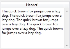
To fix the problem either reduce the total columns' widths to equal the list box object's width subtracting the pixel width of the scroll bar or increase the list box object's width by the amount as shown below.

Thus when creating list boxes the width of the scroll bar needs to be taken into account for a nice user interface design.
For Windows this width is 17 pixels and for Macs this width is 15 pixel.
If the total width of the columns match the width of the object the last colomn's last 17 or 15 pixels will be obstructed by the scollbar as seen in the example below where the column's width and the list box object's width are equal. Parts of the text seem to be cut off because the last 17 pixels of the column are covered.

To fix the problem either reduce the total columns' widths to equal the list box object's width subtracting the pixel width of the scroll bar or increase the list box object's width by the amount as shown below.

Thus when creating list boxes the width of the scroll bar needs to be taken into account for a nice user interface design.
