
Tech Tip: Button Grids for Custom Actions
PRODUCT: 4D | VERSION: 16 | PLATFORM: Mac & Win
Published On: February 22, 2018
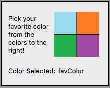
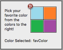
Button Grids are 4D objects that can be placed on top of other objects to provide some clickable functionality. For example, if an application requires the user to pick their favorite color from four different colors, the form may look something like this:
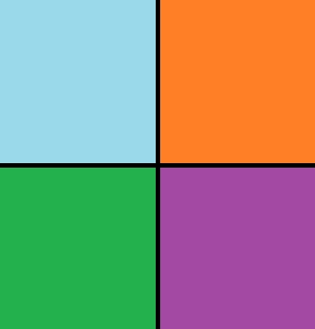
Where the colored image with the four colors is simply a custom graphic designed to fit the needs of the application:
To allow the user to click on the squares and pick a favorite color, a button grid object can be placed on top of the graphic on the form:
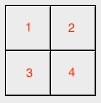
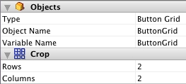
The Button Grid object can be set to have the desired number of columns and rows, in the case of this example 2 columns 2 rows, and given a form method. The method linked to the button gird object, on the On Clicked form event, will return to the variable / object name for that button grid a number corresponding to the grid numbered from 1 to n, left to right and top to bottom like this:
The object method then, to grab the color clicked and pass into the favColor variable, can be simply written as follows:
And the Button Grid is placed on top of the custom graphic:
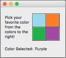
Screenshot of the example form, with the fourth box clicked:
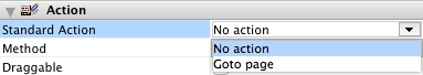
As a note, the default action for a button grid object is "No action", which is the action selected for the above example. The "Goto page" action can be used as a standard action to make the Button Grid buttons change the form pages from one to the next, taking the grid number clicked and going to that page on the form, if it exists.
Where the colored image with the four colors is simply a custom graphic designed to fit the needs of the application:
To allow the user to click on the squares and pick a favorite color, a button grid object can be placed on top of the graphic on the form:
The Button Grid object can be set to have the desired number of columns and rows, in the case of this example 2 columns 2 rows, and given a form method. The method linked to the button gird object, on the On Clicked form event, will return to the variable / object name for that button grid a number corresponding to the grid numbered from 1 to n, left to right and top to bottom like this:
The object method then, to grab the color clicked and pass into the favColor variable, can be simply written as follows:
| Case of : (ButtonGrid=1) favColor:="Blue" : (ButtonGrid=2) favColor:="Orange" : (ButtonGrid=3) favColor:="Green" : (ButtonGrid=4) favColor:="Purple" End case |
And the Button Grid is placed on top of the custom graphic:
Screenshot of the example form, with the fourth box clicked:
As a note, the default action for a button grid object is "No action", which is the action selected for the above example. The "Goto page" action can be used as a standard action to make the Button Grid buttons change the form pages from one to the next, taking the grid number clicked and going to that page on the form, if it exists.