Tech Tip: Automatic component margins in Qodly Studio web form
PRODUCT: Qodly Studio | VERSION: 20 | PLATFORM: Mac & Win
Published On: November 20, 2023
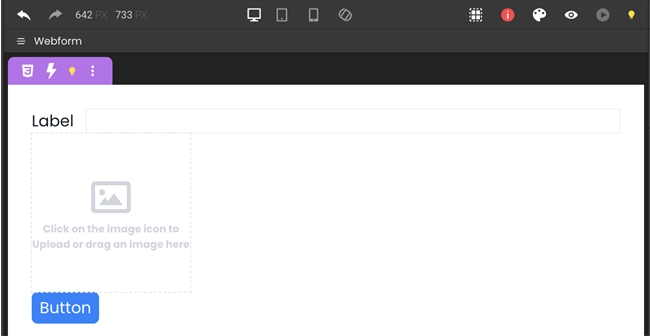
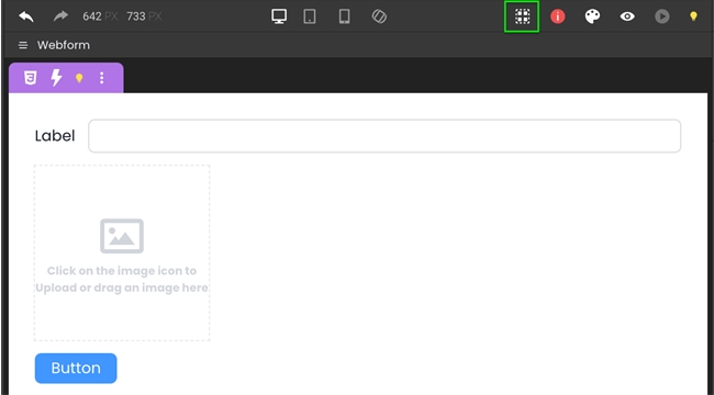
When designing a webform in Qodly studio, components on the form should have enough space between them so that the user interface does not look constricted. To achieve this, the layout of each component can be individually adjusted by adding margins, or automatic margins can be added by toggling on “Airy Layout”. This feature conveniently adds margins to each component (and may also slightly adjust its appearance) so that the webform looks spacious and presentable. Compare the examples below:
Without Airy Layout

With Airy Layout

The above examples are of the same webform in two different layout modes. The first is in the default neutral layout, while the second has airy layout turned on (green box). Using airy layout not only makes the webform look better, it accelerates the development process by removing the need to tediously add margins to every single component.
Without Airy Layout

With Airy Layout

The above examples are of the same webform in two different layout modes. The first is in the default neutral layout, while the second has airy layout turned on (green box). Using airy layout not only makes the webform look better, it accelerates the development process by removing the need to tediously add margins to every single component.
