
Tech Tip: How to Customize Color of Checkbox After User Enable
PRODUCT: Qodly Studio | VERSION: 20 R | PLATFORM: Mac & Win
Published On: September 26, 2025
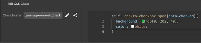
When working with a CheckBox component, it may be useful to know how to apply a CSS class so that it appears with a custom coloring after a user clicks to enable the checkbox. First, create a custom CSS class in the Styles Library. Then, add the selectors ".chakra-checkbox span[data-checked]" to the "self" selector. After adding a declaration block, the color of the box and the checkmark can be customized with the "background" and "color" properties, respectively. For example:
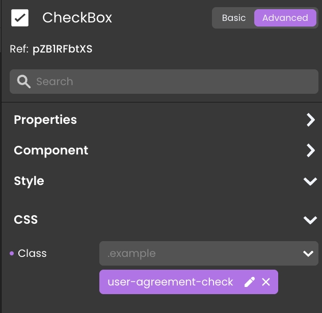
Finally, apply the custom CSS class to the CheckBox component. Note that the custom CSS class should be applied to the general CheckBox component (checkbox + label), not the checkbox itself.
The checkbox should now "check" with a custom color styling.

Finally, apply the custom CSS class to the CheckBox component. Note that the custom CSS class should be applied to the general CheckBox component (checkbox + label), not the checkbox itself.
The checkbox should now "check" with a custom color styling.