
Tech Tip: Quickly View Default Theme CSS Class Definition for Specific Component
PRODUCT: Qodly Studio | VERSION: 21 | PLATFORM: Mac & Win
Published On: March 26, 2026
When working in Qodly Studio, be aware that most simple components have some default theme CSS class definitions that do not appear in the Styles Library. These differ in a few ways from theme CSS classes that are added to the component.
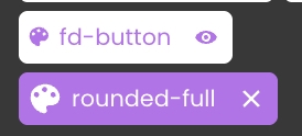
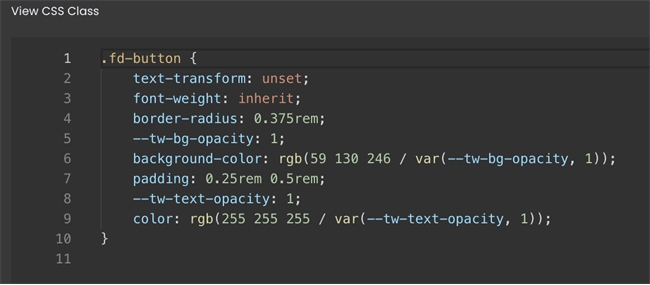
For example, in the above screenshot, the top is default-theme while the bottom is added-theme. The default theme class has lighter background with smaller palette icon to identify it as theme CSS. Most importantly, the default has an eye icon to the right instead of an X, meaning that it cannot be removed from the component. The definition for the default theme CSS class can be quickly viewed by clicking on the eye icon.
For example, in the above screenshot, the top is default-theme while the bottom is added-theme. The default theme class has lighter background with smaller palette icon to identify it as theme CSS. Most importantly, the default has an eye icon to the right instead of an X, meaning that it cannot be removed from the component. The definition for the default theme CSS class can be quickly viewed by clicking on the eye icon.